TOURISM TASMANIA
Overhaul the travel experience: From dream to experience

Key results
additional active sessions in the 6months following launch
increase in monthly click-throughs to vendor booking sites
app downloads in the first 3 months
average app engagement time per user
The challenge
Research by Trip Advisor indicates that nearly 80% of travellers invest about four weeks in planning their trips. A tourism-authority’s website should be more than a mere window into the location. It must also simplify the journey of discovery and planning and serve the interests of regional tourism businesses while maintaining allure.
Armed with this insight, Tourism Tasmania, a government-supported destination marketing organisation, wished to create an innovative, personalised, and data-driven digital experience. Their vision was to seamlessly connect various channels and touchpoints to enhance both the travel planning process and the on-ground experience for those venturing to Tasmania.
With this goal in mind, Tourism Tasmania sought a strategic partner capable of guiding them through the entire process, from customer experience design to the implementation and activation of their new platform, Optimizely.
The goal
Beyond transitioning Tourism Tasmania's digital ecosystem from a dated 14-year-old legacy platform to the Optimizely DXP within a tight 5-month timeframe, we also aimed to:
- Enhance digital visitor tools supported by an advanced marketing technology platform
- Simplify the management of multiple websites for seamless operation
- Ensure all designs followed the new branding guidelines.
- Offer a unified and personalised consumer experience through a robust customer data platform (CDP)
- Enable extensive experimentation to improve on-site conversions
- Develop a functional mobile App for travellers, streamlining their on-ground experience for added convenience in the moment
The solution
Our customer experience strategy revolved around three core principles: explore more, act faster, and deliver delight. Our aim was to encourage travellers to discover less conventional Tasmanian experiences, in a simple, highly-personalised way. After all, trip planning shouldn't be a hassle, should it?
To materialise this vision, we unveiled a revamped Discover Tasmania website. This enhanced platform assists visitors in planning their Tasmanian holidays by offering personalised recommendations based on both inferred and declared interests.
Tools and content were designed to streamline the trip or itinerary creation process, seamlessly integrating ATDW data (Australian Tourism Data Warehouse) listings. This integration will significantly boost leads for the tourism industry.
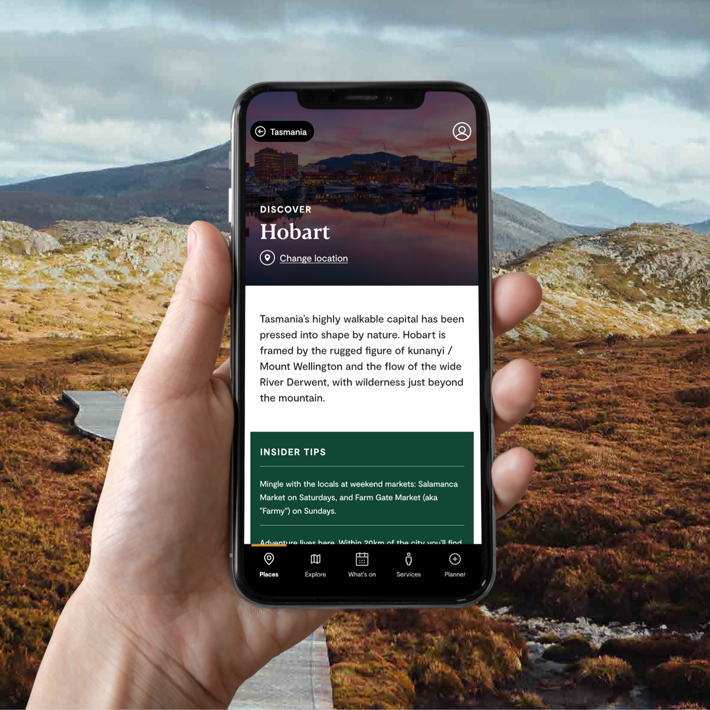
Additionally, we introduced a comprehensive app, serving as a “pocket travel guide”. This innovation not only elevates exposure for Tasmanian tourism operators but also leverages BlueDot technology, delivering precise location-based messaging when travellers need it most. This allows businesses to tailor experiences for their visitors, ensuring a more curated and engaging travel experience.

The tech stack
We rebuilt the Discover Tasmania website using the Optimizely Digital Experience Platform, allowing us to enhance and customise the user journey in real-time. This is supported by Optimizely’s Content Intelligence and Content Recommends platforms. These helped us to understand the performance of Tourism Tasmania’s wealth of content and make and recommendations to site visitors based on their learned interests. We also re-configured and activated the Customer Data Platform. This powerful tool uncovered valuable insights into user preferences and behaviours, enabling us to continuously refine and tailor the customer experience.
For the app we used BlueDot, a location tracking technology, to track when a user had entered and left a pre-defined geographical area. These areas could be as small as specific buildings or as large as a city or National Park. They included such locations as Launceston, Hobart, Salamanca Markets and Cradle Mountain. All notifications were stored in the Optimizely CDP.


OUR CRAFT
We deliver work
that works
Understanding customer’s behaviours better to become a data–lead organisation
Beyond Bank

3D Commerce: Crafting a new accessory experience with CGI
Hyundai

Making the skincare buying journey joyously simple
Clear Skincare

Overhaul the travel experience: From dream to experience
Tourism Tasmania


